Free Googly Eye Appliqué for Valentine's Day
/ Zé has a thing for googly eyes, so a few weeks ago I picked up a set of large, 4" eyes for him. When I got home, Emir mentioned that they'd be fun to have on a shirt—so here we are, a boy-friendly Valentine's design!
My idea was to incorporate the eye in a way that's removable for washability and for when Zé decides he's had enough and just wants the eye off. So when you take the googly eye out, there's another appliqué eye underneath. It's one shirt, two ways!
Supplies To make your own, you'll need:
- Applique Pattern (free download)
- 4” Googly Eye
- Shirt
- Fabric for applique (I used old t-shirts)
- Wonder Under (or other fusible web)
- Sewing machine
- Pen, marker, or other marking device (to sketch the mouth)
- Iron
- Fuse the Wonder Under to your fabric and cut out the pattern pieces.
- Starting with the horns, peel off the paper backing and fuse each one into place.
- Fuse the monster body in place being careful to make sure it slightly overlaps the bottoms of the horns.
- Fuse the appliqué eye-white in place on top of the monster body.
- Decide on the desired placement and fuse the pupil onto the eye.
- Using a pen or marker, trace the mouth in place (it may help to place the pattern piece behind the shirt and hold the whole thing against a window) then position the teeth and fuse in place.
- Sew a line of straight stitches around each of the different pieces, changing thread colors as needed.
- Using a satin stitch (a tight zig-zag), stitch along the mouth you traced in step 6, making sure your stitching covers the base of the teeth where they overlay the mouth.
At this point, you have a cute shirt! You could stop here, but if you want to add the googly eye, read on.
Adding the Google Eye The secret (ok, not really) is using ribbing to form somewhat of a pocket to hold the googly eye in place. The eye I used measures 4" in diameter, making a circumference of roughly 12.5", so I cut a 2 x 9" strip of ribbing. You want the ribbing to be shorter than the actual space it will occupy so it has to stretch.
- Cut the ribbing to desired size and with a zig-zag stitch, sew the long edge together (right sides facing).
- Turn the tube right side out, press, fold in half and sew the short ends together, forming a circle.
- Divide the circle of ribbing into fourths by placing a pin at the top, bottom, and center of each side of the circle. Do the same on the white eye on the shirt, dividing the eye into forth with pins.
- Place the ribbing in place around the eye of the shirt (with the raw edges facing inwards), matching up the pins to evenly distribute the ribbing. Pin in place using additional pins as needed (I like to add another pin between each of the existing pins, dividing the eye into 8ths to make sewing easier). Check out this pic to see an in-progress example from another google eye shirt I made.
- Using a zig-zag stitch, sew around the inner (raw) edge of the ribbing, making sure the stitching stays outside of the white appliqué underneath (to prevent it from being seen outside of the ribbing).
- All done! Flip the ribbing inwards, press, and pop in the google eye.
Don't forget to tag me on Instagram (@kplicanic) so I can see your handiwork. Have a Happy Valentine's Day!
 Check out this darling print design made with assets from this week's Creative Market freebie downloads! Pick up the

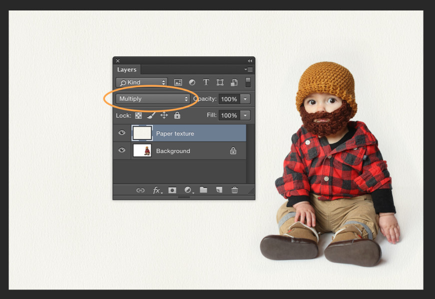
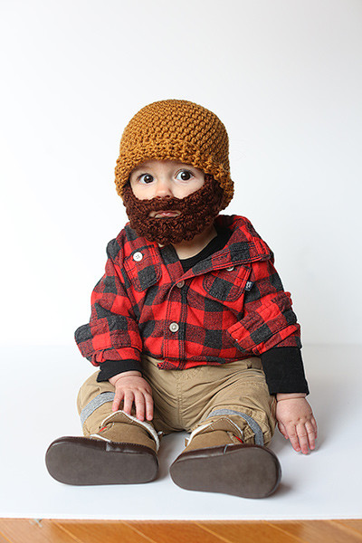
 In celebration of Zé's first Halloween and the lumberjack hat/beard I crocheted for him, I put together the above graphic and thought it'd be fun to share how I made it.
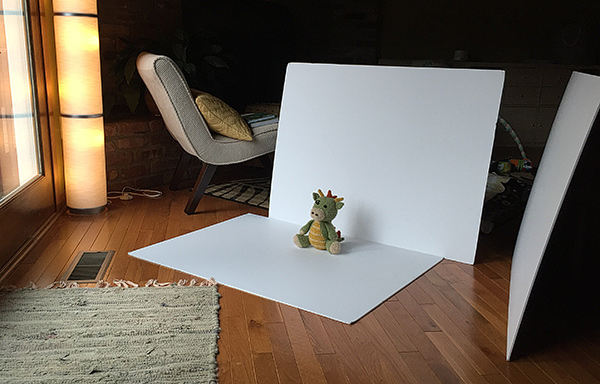
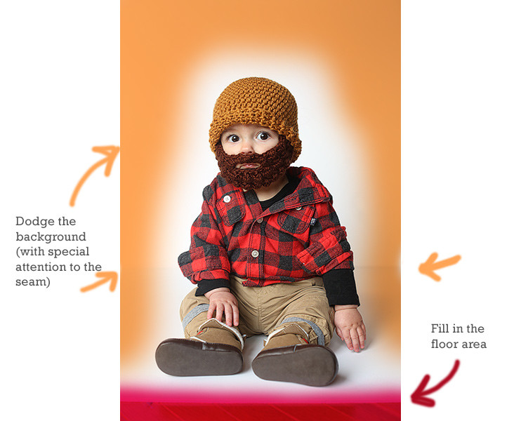
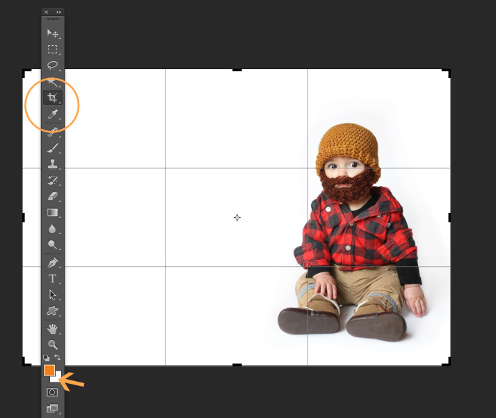
 Once the background was cleaned up, I used the Eye Dropper Tool and Option/Alt clicked to load the white background color as my active background swatch. Then, I switched to the crop tool to resize the whole image. (You can leave the settings blank and just drag from the corner to visually adjust the canvas area, or enter specific dimensions if you know what size you want the final piece to be.) Photoshop will fill in the canvas area with whatever color you sampled for your background swatch when you Option/Alt clicked with the Eye Dropper. This makes it possible to use the crop tool to essentially reformat the image and extend the background, creating room for our design. If you did a good job of cleaning up the background area, it should appear seamless.